Sophie Smallhorn is a British artist and colourist. From a design-led background, Smallhorn practice stretches across various mediums such as sculpture, installations and works on paper - and the artist sees no restrictions in how colours can impact the appearance within its surroundings. The representation of her work is down to the most elementary components: form, volume, shape and colour. With the release of
Layer 1 and
Layer 2, Smallhorn introduced texture to her method, allowing herself to further explore the relationship between colours.
Smallhorn refers to Joseph Albers and Agnes Martin as a key influence in her practice. In 1963 Albers published the book ‘Interaction of Color’ and today it is considered a masterpiece within the field of colour theory. Starting as a teacher at Bauhaus in Germany, Albers was quickly recognised as a renowned artist himself. His series of paintings titled ‘Homage to the Square’ (~1950 - 1975) became a life-long journey for the artist and a personal exploration into theory on how colours influence each other. Unlike Albers, Smallhorn doesn’t have a colour theory she strictly adheres to. Instead she establishes a set of rules before starting on new artwork or project. Setting parameters allows her to work more freely within her self-imposed boundaries; such could be “only use 8 colours” or “no reds”. Too much choice can inflict chaos.
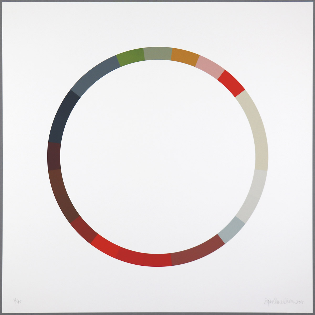
In ‘Colour Wheel 1’ (2001), one of her first print edition, Smallhorn took on the colour wheel; an essential reference-tool for people within the field of colour theory. Invented by Isaac Newton in 1666, who mapped the colour spectrum into a circle, the wheel is used to visualise the relationship between colours; some are warm and cool, some are in harmony or in contrast to each other. Smallhorn’s colour wheels are different. Her sequence of colours does not follow the traditional theory and instead she follows her intuition; in her wheels one colour informs the next. This has created a series of work which may be puzzling at first sight, as they conflict with our perception of the original colour wheel, but their individuality and balance become their beauty. The series created between 2001-2015 currently contains six works titled
’Colour wheel’ .
SOPHIE SMALLHORN
Colour Wheel 6, 2015
Edition of 45
6 Artist Proof (APs)
84(w) x 84(h) cm
33.07(w) x 33.07(h) inches
SOPHIE SMALLHORN
Colour Wheel 6, 2015
Edition of 45
6 Artist Proof (APs)
84(w) x 84(h) cm
33.07(w) x 33.07(h) inches
|
|
|
84(w) x 84(h) cm
33.07(w) x 33.07(h) inches
|
14 Colour screenprint on Somerset 410gsm paper with hand torn edge.
Signed and numbered on front
Edition of 45
|
|
Layer 1 and
Layer 2 show a different side to Smallhorn’s practice. Here, the artist allows colours to overlap, or uses simple patterns, to create new colours. This is different to her Colour Wheels, where each colour is only influenced by the colour next to it. Although Smallhorn follows the same thought process for all her work, these screenprints are visually different with the use of patterns, squares and rectangles - compared to the well-proportioned and perfect circle.
In the two print editions
Sophie Smallhorn explores two methods of application; one involves several overlapping block colours; the second introduces texture, in the form of parallel thin lines. Working with overlapping colour can be best described as being a colour alchemist - and one that requires a deep understanding of how the appearance of colour changes. Texture, such as linear thin lines, work differently to block colours when overlapping, as the void between the lines will allow any colour underneath to blend into it, still keeping its properties.
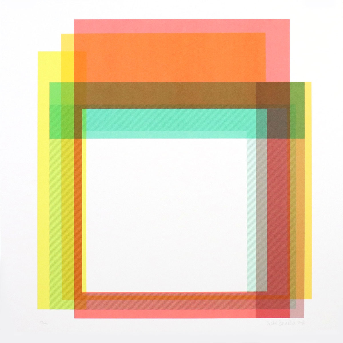
SOPHIE SMALLHORN
Layer 1, 2016
Edition of 45
6 Artist Proof (APs)
84(w) x 84(h) cm
33.07(w) x 33.07(h) inches
SOPHIE SMALLHORN
Layer 1, 2016
Edition of 45
6 Artist Proof (APs)
84(w) x 84(h) cm
33.07(w) x 33.07(h) inches
|
|
|
84(w) x 84(h) cm
33.07(w) x 33.07(h) inches
|
6 colour screenprint on Somerset 410gsm paper.
Signed and numbered on front
Edition of 45
|
|
Comparing to Smallhorn’s previous work, the a-symmetrical composition of
Layer 1 and
Layer 2 is a departure from her otherwise clear-cut forms. The composition is kept in a square formation with a void, untouched in the middle. In
Layer 1 the palette is bright and warm. Nuances of yellow and rose hues monopolise the appearance, only to be elegantly outmanoeuvred by a smaller rectangular block of aqua green. The six screenprinted colours create several new tones and hues as they partly overlap. The two yellow hues together create a ripe banana yellow, which again creates a pumpkin orange when mixed with the rose-coloured layer. Among the flat colours a textured layer in green crystal, a light shade of cyan, was applied to make appearance more vibrant.
The colours in
Layer 2 are more softened and composed from seven layers such as violet, nude and beige. Several tones of pinks and purples are coming to life as the colours blend into each other; sometimes with interfusion of up to four layers. In the top a terracotta brown emerges from the marrying of a light plum-coloured mauve and a mustard yellow, while on the left, the textured violet bring energy into the work.
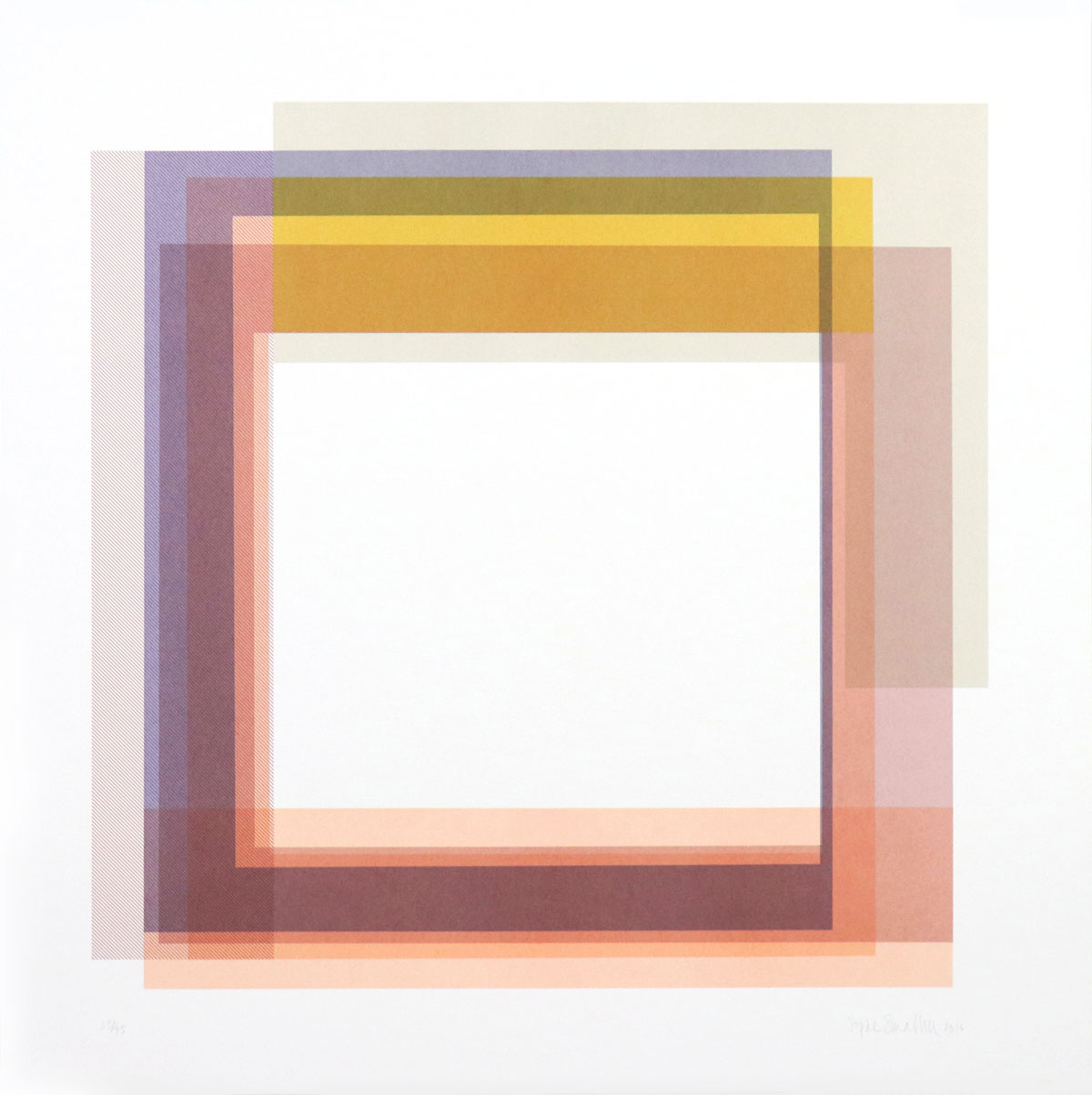
SOPHIE SMALLHORN
Layer 2, 2016
Edition of 45
6 Artist Proof (APs)
84(w) x 84(h) cm
33.07(w) x 33.07(h) inches
SOPHIE SMALLHORN
Layer 2, 2016
Edition of 45
6 Artist Proof (APs)
84(w) x 84(h) cm
33.07(w) x 33.07(h) inches
|
|
|
84(w) x 84(h) cm
33.07(w) x 33.07(h) inches
|
7 colour screenprint on Somerset 410gsm paper.
Signed and numbered on front
Edition of 45
|
|
Smallhorn’s approach to a new work is to meticulously plan the process. For a large installation, such as for the 2012 Olympics in London, she created a small-scale model of the Olympic Stadium and experimented with the composition of colour within it.
Similarly, for the two print editions,
Layer 1 and
Layer 2, the artist created sample colour swatches and stencils; some were rectangular blocks and others were squares with an empty space in the middle. Starting with a series of stencils, Smallhorn mapped out the desired composition for each print. In the printing process that followed, the overlapping layers created new hues that are influenced by the colour that run through them - and run alongside them. The magical process of transformation; combination of colour and layering; resulted in two prints that are perfectly and visually aligned.
Sophie Smallhorn’s sculptures, installations and print editions have been exhibited internationally since her graduation from the University of Brighton in 1994. Her artwork has been included as part of the Summer Exhibition at the Royal Academy of Arts in London - and at the Saatchi Gallery in the collaboration titled ‘ColourWare’ with the British industrial designer, Sebastian Bergne.
You can find more information about the two print editions
Layer 1 and
Layer 2 on
Sophie Smallhorn’s artist page
here.